8 Email Design Trends in 2019

Looking for new strategies to improve your email marketing performance? Would you like to learn new design trends that will increase the interaction of your email messages?
Email Monks team shared the design trends of the e-mails in 2019 with an infographic.
Here are 8 email trends that will be popular in 2019 according to Email Monks:
1. Usage of APNG in Email

APNG is an animation supported version of the PNG image format. Stuart Parmenter and Vladimir Vukićević from Mozilla created this format in 2004. However, the APNG was not adopted by the PNG group in 2007. In 2016, Apple chose APNG format to make animated stickers in iOS 10 iMessage application. The APNG format can be compared to GIF, because both formats support animated images (with multiple frames).
APNG supports 24-bit color and 8-bit Alpha transparency, while the GIF format supports 8-bit color, but no transparency support. The file size of APNG is a bit more than GIF, but the visual quality is more. The APNG format is supported by many e-mail clients, such as Outlook, Gmail mobile app and the desktop version.
2. Email within smart designs
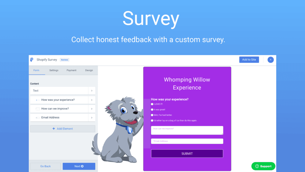
In 2019 we will see smart applications in email designs. This way, users who send email messages will be able to take action from mail mailboxes. For example, by adding survey applications into the email and redirecting the user to any landing page, the results will be retrieved. Already in today’s e-mail marketing, the clickthrough rate of users in the content links is gradually decreasing. This will motivate the users in email as much as possible. In fact, we’ll see digital marketing actions that add games and apps in email and interact with users directly from email.
3. We will see more striking and extraordinary designs
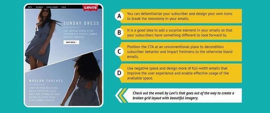
In general, conventional email designs are made up of header, body and footer and grid system is used. However, this kind of designs are starting to annoy. That’s why we’ll see more of the designs out of the classic grid system, which leave the classic e-mail design. This way, users can see more striking designs and pay more attention to e-mail messages. At the bottom of the article we share with you the Infographic, you can see Lewis’s unusual email design and get ideas.
4. Use of AMP in Email
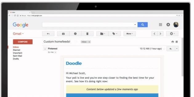
AMP (Accelerated Mobile Pages) is the name of Google’s project, which aims at faster mobile use, showing only the components required in mobile versions of sites. Site owners can make their sites AMP compatible and show AMP versions of websites in mobile view. Google is said to give more priority to the pages with AMP, but we don’t have any clear knowledge about it, because such issues are constantly changing. We’ve even heard that Google may put an end to AMP, so let’s not give false information.
Returning to our subject, we can see the AMP feature, which makes the sites load faster on mobile, in email designs in 2019. As you know, at least 60-70 percent of the internet traffic is direct mobile devices. Therefore, being faster on the mobile, the need for e-mail messages as well as websites.
Google announced in 2018 that it will support dynamic email messages with AMP. In addition to simplifying the mobile versions of these e-mails, it also enables dynamic and ever-changing email designs. So your email message can be kept up-to-date as long as the user doesn’t delete it… 🙂
5. Developments in visuals
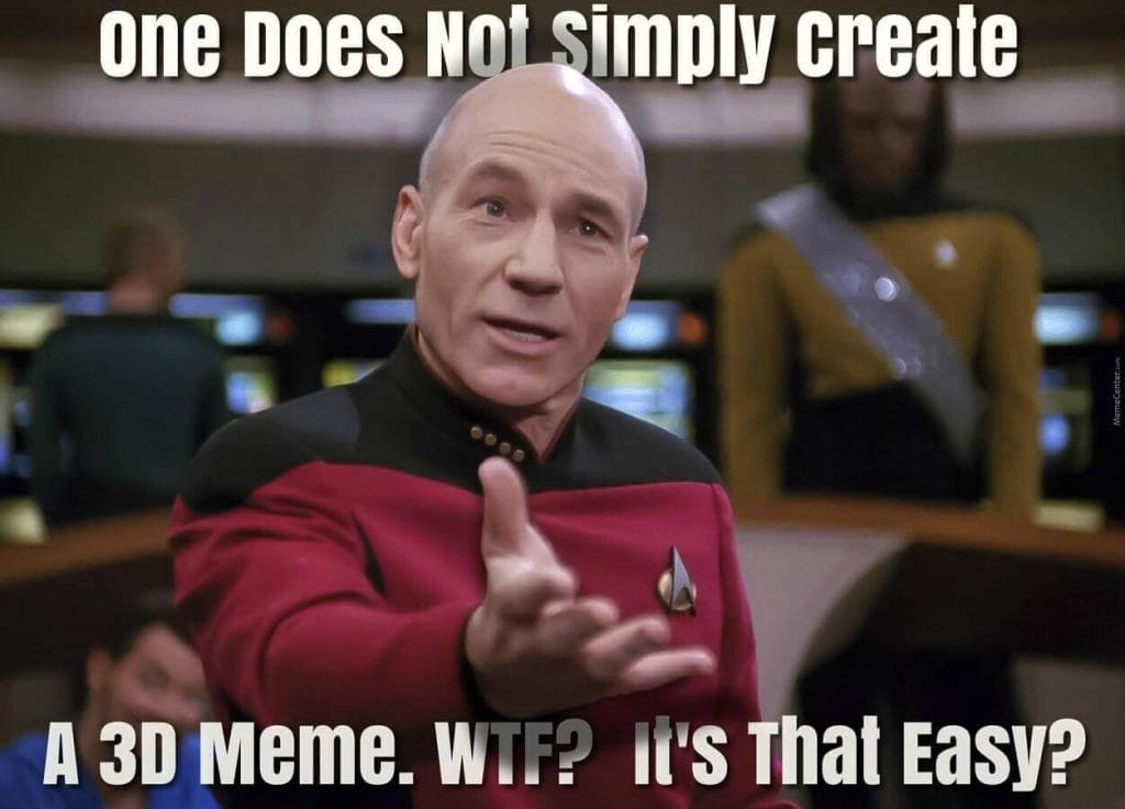
In 2019, we will see three-dimensional images such as 3D meme, photorealistic visuals, email specific illustrations, black-and-white designs in email designs. For details, see the Infographic at bottom of page.
6. Live social media streams
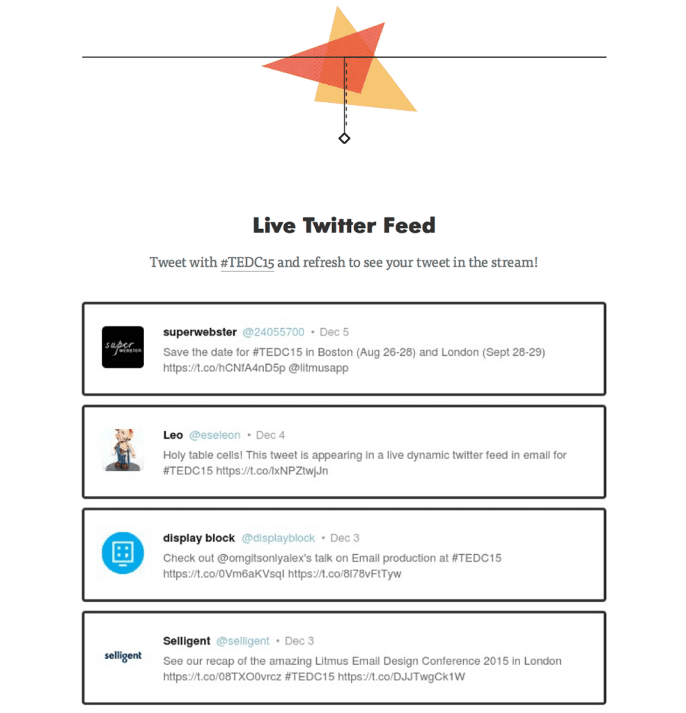
Don’t be surprised if you see live social media streams in e-mail messages in 2019. Because this type of applications began to be a trend. You can attract more visitors to your website by putting live social media streams on your brand’s Twitter, Instagram and Pinterest into your email designs.
7. Typography and fonts
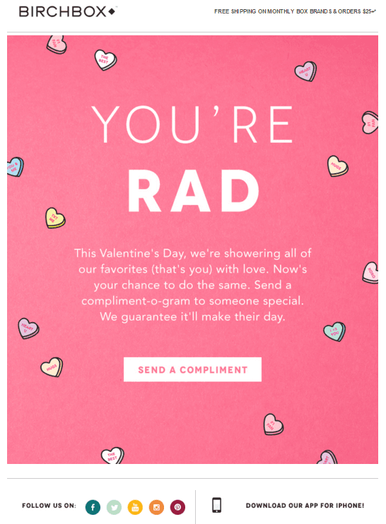
We will see the use of innovative fonts and font size in e-mail designs. Thus, more attention will be paid to the users who have subscribed to the mailing list. You can see the Aeropostale example in Infographic.
8. E-mail in video
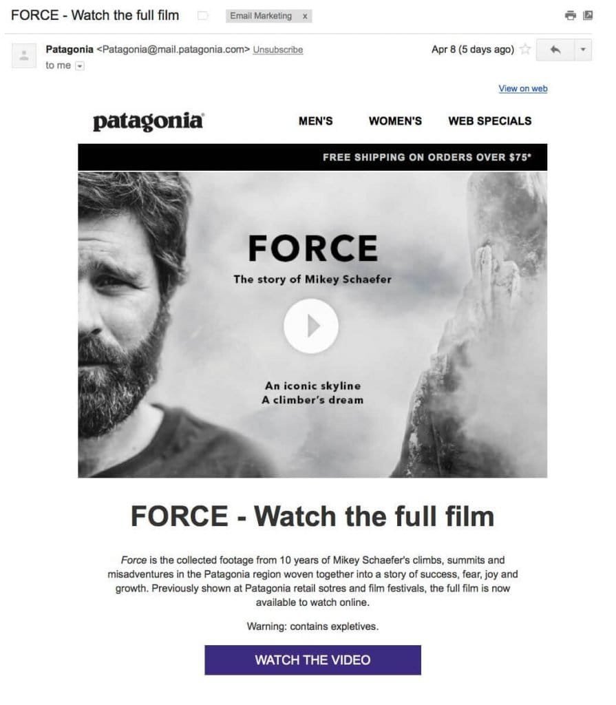
We talked about everything, not to mention the video in e-mail. Research has shown that video e-mails are opened 19 percent more and more than 59 percent more clicked on the links. That’s why in 2019 we can often see videos in e-mail designs.
You may also be interested in: 7 Analytical Tools for Instagram


These are excellent ideas, thank you. You’ve given me many new ideas to improve on my email marketing campaigns.
Cheers,
Suzanne
Your welcome Suzanne, thank you for your nice comment.